Your logo is one of the most powerful tools your business has. It appears on your website, your business cards, your signage, your social media profiles, and every document you send to a client. In a matter of seconds, often before a single word is read, your logo tells people who you are, what you stand for, and whether you can be trusted.
But what happens when your logo is telling the wrong story?
Many small business owners hold onto their original logo out of habit, sentiment, or simply because they haven’t stopped to evaluate it critically. The truth is, a logo that made sense five years ago may be quietly undermining your brand today. The good news is that recognising the problem is the first step to fixing it.
Here are five clear signs that your business logo needs a redesign, and why acting on them sooner rather than later can make a real difference to how clients perceive you.
1. Your Logo Looks Blurry or Pixelated
This is one of the most common and most damaging logo problems a small business can have. If your logo appears blurry when placed on your website, stretched on a banner, or pixelated when printed on letterheads, your business immediately looks unprofessional. No matter how good your services are, a fuzzy logo creates doubt in the minds of potential clients.
The root cause is usually that the original file was saved at a low resolution or in a format not suited for scaling, such as a small JPEG. A professionally designed logo should be supplied in vector format (such as an AI or EPS file), which means it can be scaled to any size without losing sharpness. Whether it appears on a business card or a 1.3-metre vinyl banner, a vector logo will always look crisp and clean.
If you’re zooming in on your logo right now and seeing jagged edges or blurring, that alone is reason enough to consider a redesign.
2. Your Logo Looks Dated: A Clear Sign Your Business Logo Needs a Redesign
Design trends evolve, and a logo that looked modern when you started your business may feel stuck in a different era today. Overly complex clipart-style graphics, clashing colour palettes, drop shadows on everything, and certain font styles are strong indicators that a logo was designed in a very specific and now dated period.
This matters because people associate visual design with quality and relevance. A logo that looks outdated can suggest, subconsciously, that your business itself is behind the times. In competitive markets, where clients are making quick decisions, that impression can be costly.
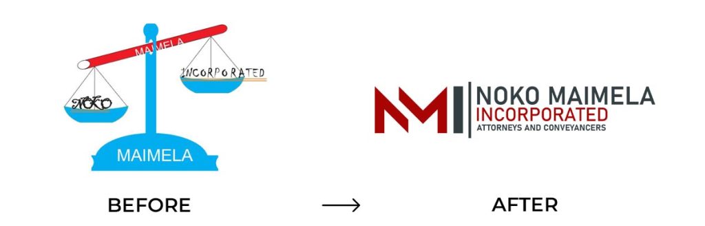
A logo redesign doesn’t mean abandoning your identity entirely. Many of the world’s most recognisable brands have evolved their logos over time, simplifying, refining, and modernising, while keeping the core of what makes them recognisable. A professional designer can help you preserve the elements that work while updating what doesn’t.
3. Your Business Has Changed But Your Logo Hasn’t
Businesses grow, pivot, and evolve. If you’ve expanded your services, repositioned your offerings, rebranded your pricing, or moved into a new market, but your logo still reflects where you were when you started, there’s a mismatch that clients will feel even if they can’t quite explain why.
For example, if your business has moved upmarket and you’re now targeting professional clients, but your logo still features a casual design that was created when you were catering to a different audience, it’s likely creating friction. Your logo should be aligned with the current version of your business, not the first version.
Ask yourself: does my logo still accurately represent what my business stands for today? If the answer is uncertain, a business logo redesign is worth serious consideration.
4. Your Logo Doesn’t Stand Out From the Competition
Spend five minutes browsing the logos of your direct competitors. Now look at yours. Does it look distinctly different, or does it blend into the crowd?
Many small businesses end up with logos that use the same generic symbols, colour families, and fonts as everyone else in their industry. While there’s a logic to using recognised visual cues in your sector, a logo that looks interchangeable with your competitors gives people no reason to remember you specifically.
Differentiation is one of branding’s most important functions. Your logo should communicate not just what industry you’re in, but what makes you different within it. A strong logo creates a visual impression that sticks, one that a potential client can recognise on a second encounter, whether that’s on social media, a brochure, or a sign on the road.
If your logo is forgettable, your business risks being forgettable too.
5. You Feel Embarrassed to Show It
This one is often the most telling sign of all. If you hesitate before handing over a business card, if you’d rather not zoom in on your logo during a client presentation, or if you find yourself explaining or apologising for how it looks, that’s a problem.
Your confidence in your brand directly affects how you present yourself and your business. When you’re proud of your branding, it shows. You hand out cards without hesitation, you share your social media profile without cringing, and you walk into client meetings feeling like your visual identity is doing its job.
On the other hand, a logo that makes you self-conscious can subtly hold you back. You may avoid marketing opportunities, delay printing new materials, or put off updating your website, all because you’re not happy with how your brand looks.
A business logo redesign is often one of the highest-return investments a small business can make. It is not just about aesthetics. It’s about giving yourself a brand you can show up with confidently. According to the Design Council, businesses that invest in design consistently outperform those that don’t, with strong branding directly influencing customer trust and purchasing decisions.
What to Do Next
If two or more of these signs resonated with you, it’s time to take your logo seriously. The good news is that a professional redesign doesn’t have to be complicated or expensive.
At Pralo Media, our Corporate Identity Package is priced at just R1,200 and includes a professionally designed logo along with the core brand assets your business needs to look consistent and credible, from your digital profiles to your printed materials.
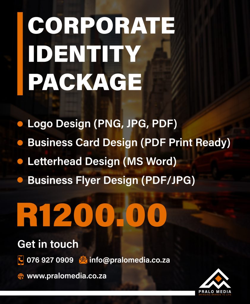
We work with small businesses across Gauteng, Limpopo, and Mpumalanga, and we understand that your brand needs to make an impression that lasts, not just look good on a screen.
If you’re ready to give your business the visual identity it deserves, get in touch with us today and let’s talk about what a refresh could look like for you.